All work

5 min read

OneLog · 2024

Streamlined interface, better collaboration.

A full redesign of OneLog, the shared login of the Swiss Digital Alliance, and the transition from Sketch to Figma that made collaboration more effective.

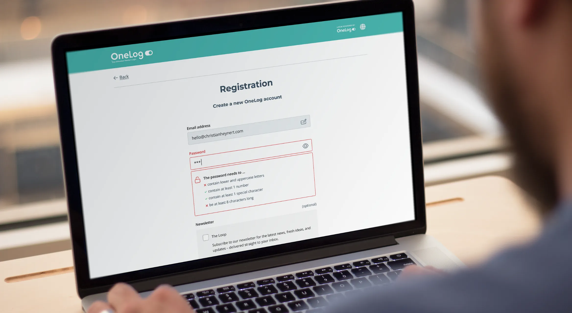
Enlarge image: A person at a laptop showing the redesigned OneLog registration screen, with a live checklist of password rules under the password field.
The redesigned registration, with password rules that update as you type.

At a glance

OneLog was the joint login service of the Swiss Digital Alliance, used by many of the country’s large media and publishing companies. When I joined in 2022, it had about two million users. Over the years the screens had collected clutter, and every new brand we onboarded made that harder to manage.

I redesigned the whole product to streamline the UI, make it easier to use and make it easier to theme. To improve collaboration with external product teams, I led the transition from Sketch to Figma, building reusable component libraries and style variables to speed up design work and keep the product scalable.

Client
OneLog AG
Industry
Swiss media & publishing
My role
UX/UI Design Lead
Duration
2023–24
Platform
Web, iOS, Android
Tools
Figma, Sketch
Deliverables
UI redesign, user flows, microcopy and translations, Sketch-to-Figma migration, design system

The challenge

The product grew, the design system didn’t.

As the step with the most potential for friction on a reader’s way from a headline to an article, often a paid one, OneLog’s single sign-on had to be quick, clear and trustworthy. Over the years, it had drifted away from that.

The code base had grown faster than the design system. New features shipped without matching components, the existing ones went stale, and the UI slowly fell out of date. The screens got busier, and every new brand theme took more work than it should have.

The tools got in the way too. Almost all our clients worked in Figma, so sharing Sketch files with them was a constant hassle. And Sketch’s prototyping wasn’t up to the job, so we needed yet another tool just for that.

Approach

First the tools, then the screens.

From Sketch to Figma.

Before redesigning a single screen, I moved the design work from Sketch to Figma. Our clients could now open the designs in the tool they already used, comment on them and follow changes, and the prototypes lived in the same file as the screens.

Switching was a big project – every screen, symbol and style had to be rebuilt, not just converted. I used it to build a proper design system from scratch, with reusable component libraries and style variables. It saved a lot of time later on, and it gave the redesign a foundation to stand on.
Calmer screens.

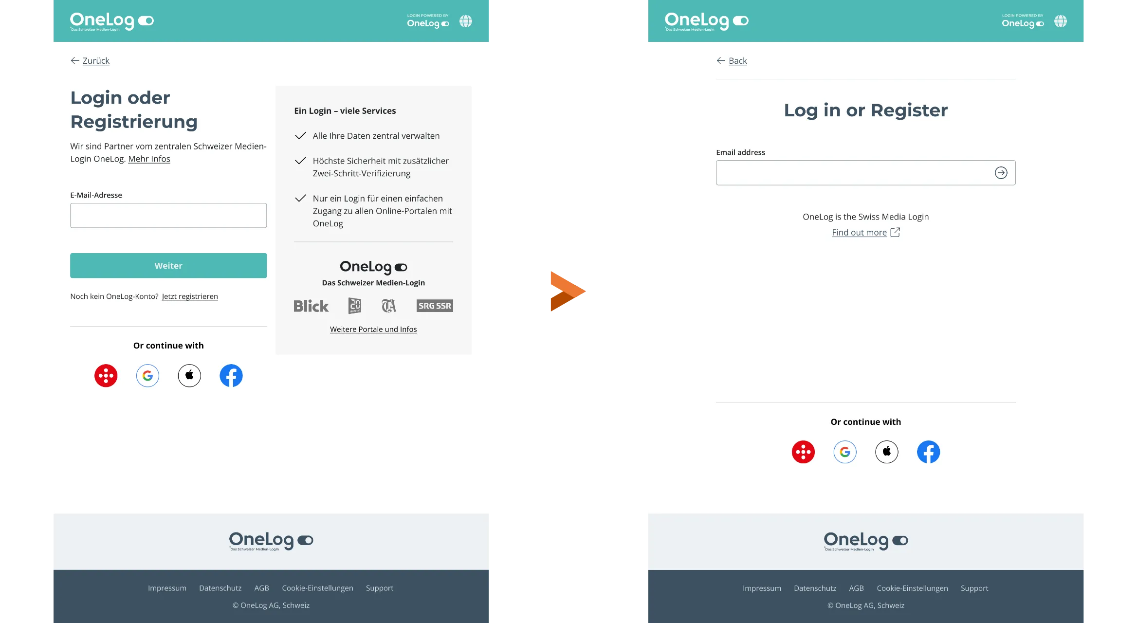
With the system in place, I started where every reader starts. The old start page split attention between the form and a panel of benefits and partner logos, with separate paths for logging in and registering. Now there’s one centred column, one question – your email address – and OneLog works out whether you log in or sign up.

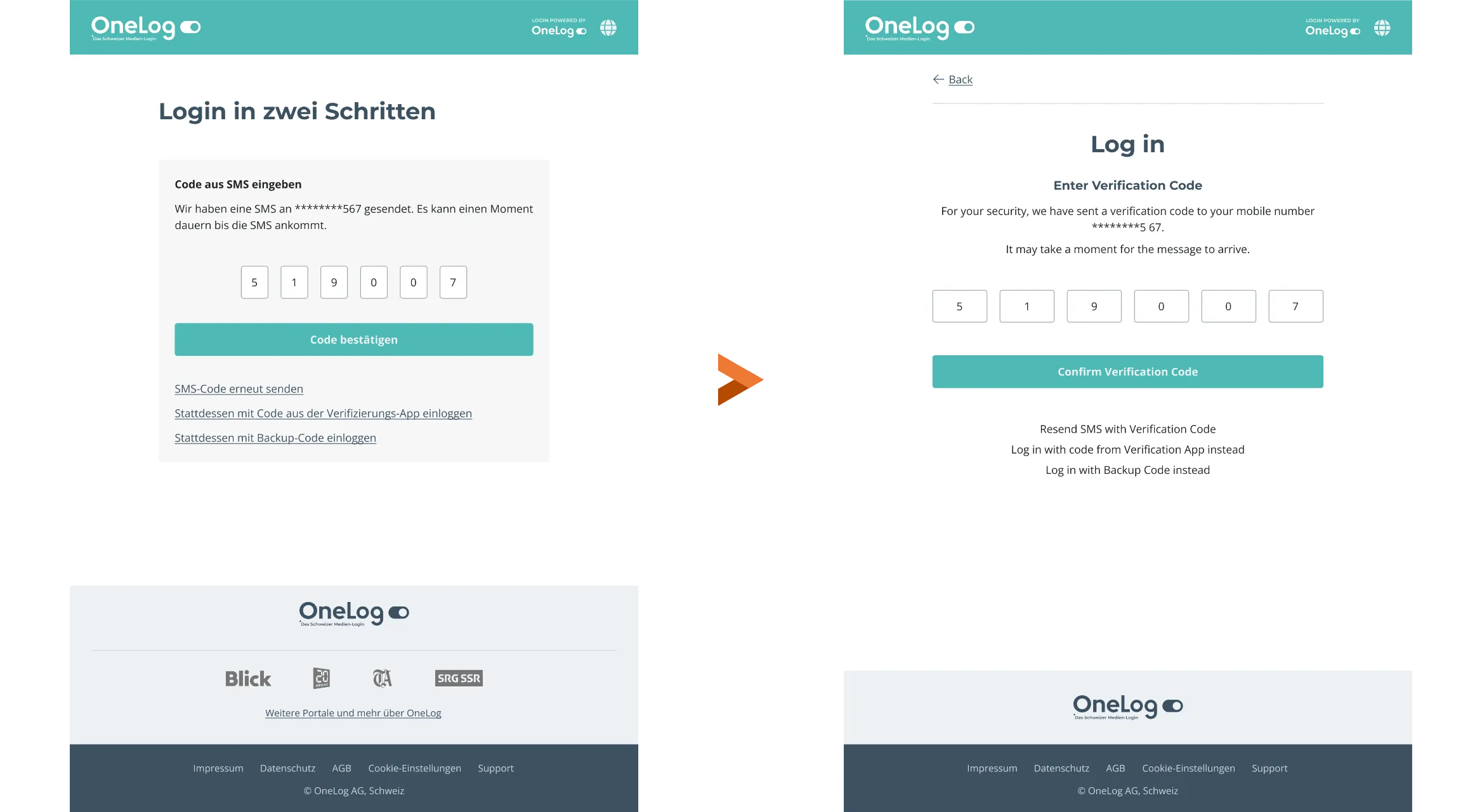
The same idea carries into two-step verification: a clear heading, larger code fields, and the alternatives – resending the SMS, using an app or a backup code – as quieter links underneath.

Enlarge image: The old and new start page side by side. The old one has a left-aligned form next to a grey panel with a benefits checklist and publisher logos. The new one has a single centred email field headed “Log in or Register”, and social login buttons below.
Start page: before and after.
Enlarge image: The old and new two-step verification screen side by side. The old one puts the six code fields, the button and three underlined links in a grey box. The new one is centred with a back link, larger code fields, a full-width button and plain text alternatives.
Two-step verification: before and after.

Registration that guides you.

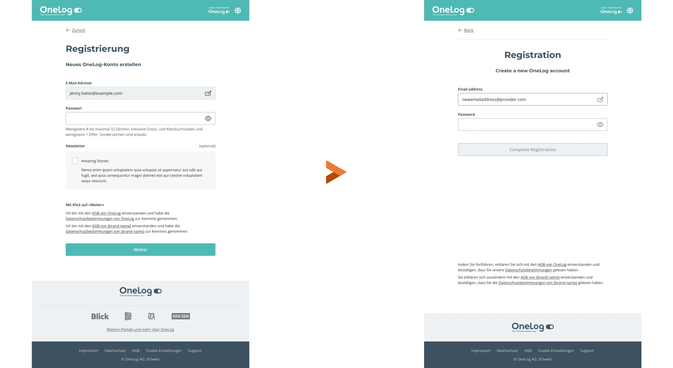
Registration used to ask for everything on one screen: email, password, newsletter and two blocks of legal consent. Now the email carries over from the start page, the first step asks only for a password, and the button stays inactive until it works. Personal details follow in a second step.

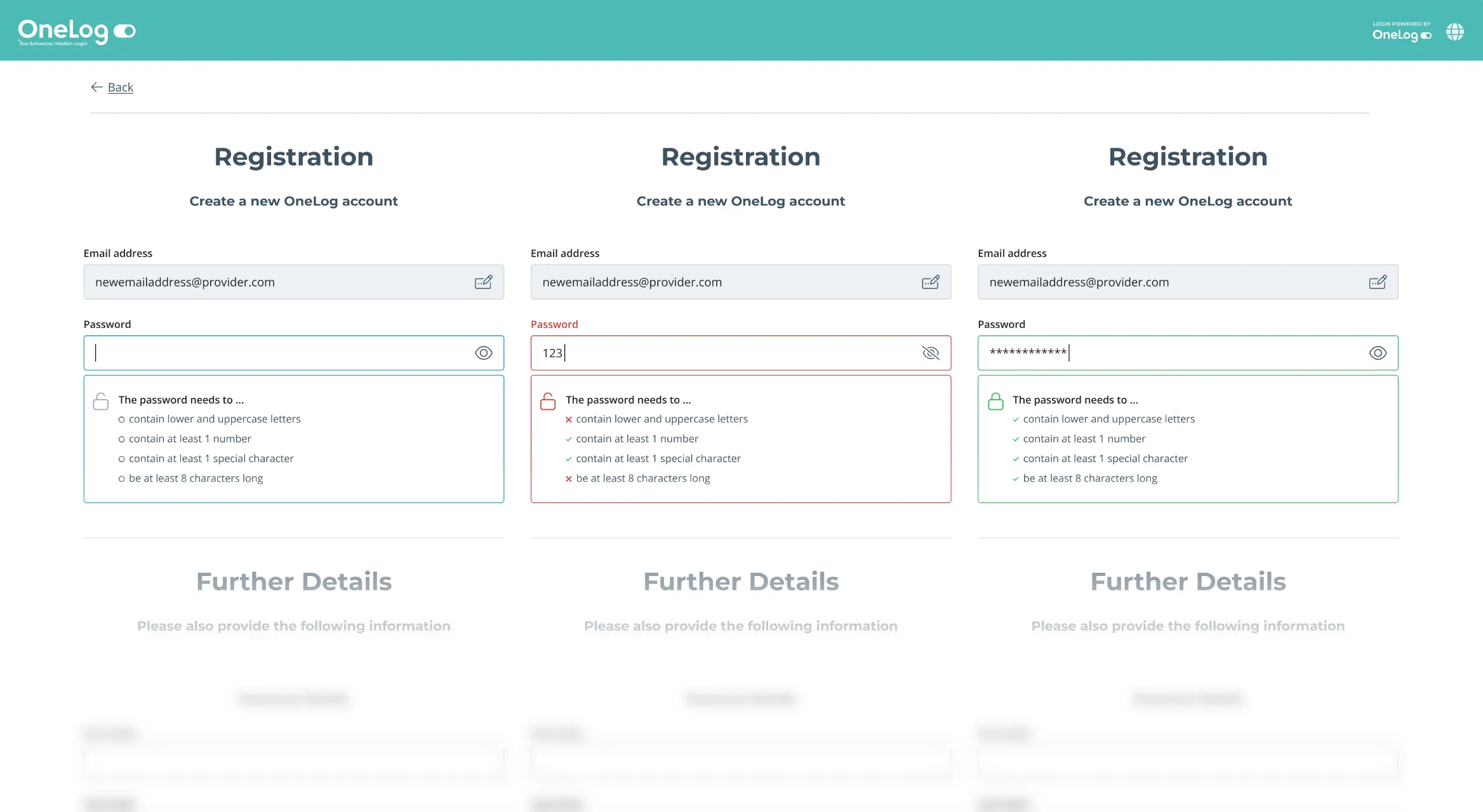
Instead of a line of rules to read before typing, a checklist under the field ticks each rule off as you type, and turns green once the password is good to go.

Enlarge image: The old and new registration screen side by side. The old one has email, password, a newsletter checkbox, two consent paragraphs and a Weiter button. The new one shows only email and password and an inactive Complete Registration button, with the legal text at the bottom.
Registration: before and after.
Enlarge image: Three registration screens showing the password checklist in three states: neutral with empty circles, red with a cross next to the unmet rules, and green with all four rules ticked.
Password rules that update as you type.

An account you can find your way around.

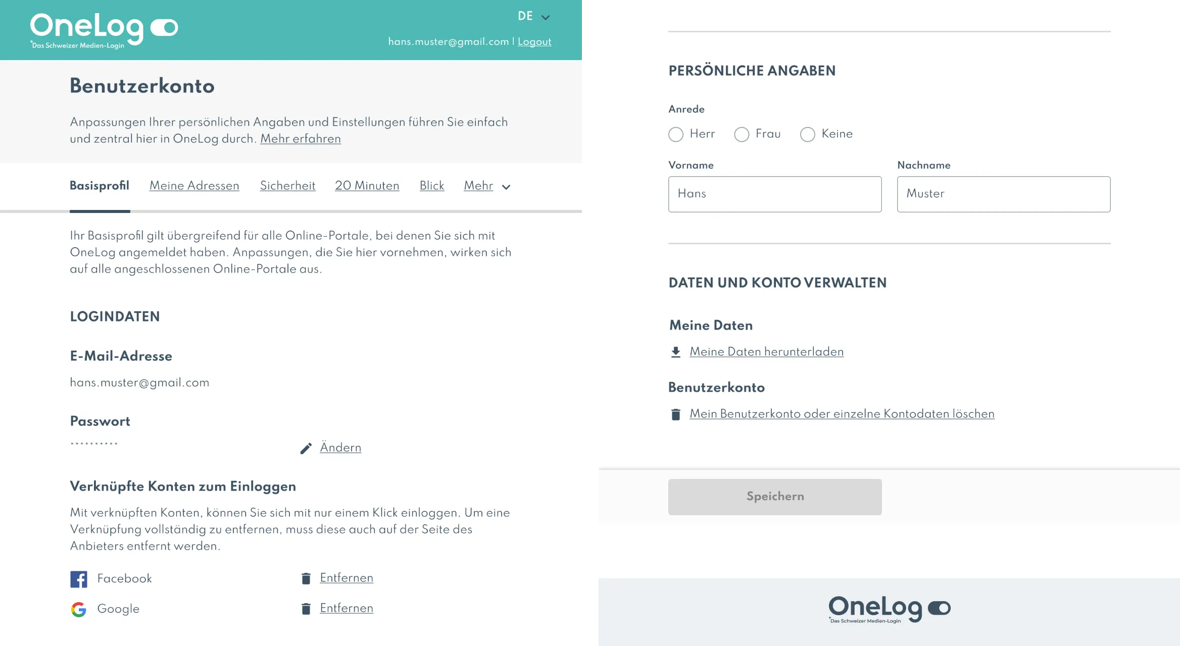
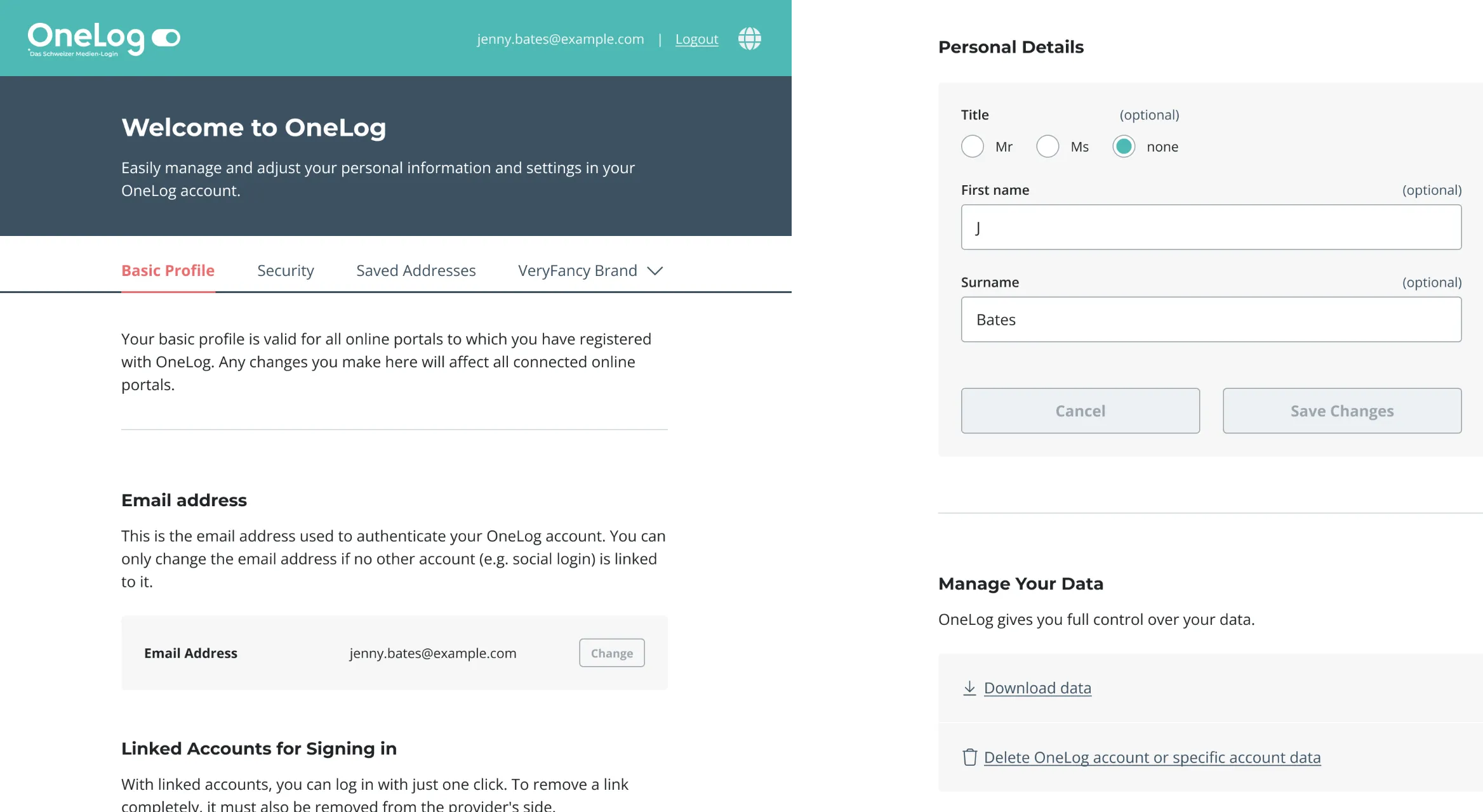
The old account page was one long form with a single Save button at the very end, and every publisher as its own tab. I grouped it into clear sections, each with its own action, so changing your email, removing a linked account or editing your name happens right where you are. Publisher settings moved into one menu, so the navigation stays the same however many brands someone uses.

Enlarge image: The old German account page: tabs for Basisprofil, Meine Adressen, Sicherheit, 20 Minuten, Blick and Mehr, uppercase section headings, linked Facebook and Google accounts with Entfernen links, and one grey Speichern button at the bottom.
Account page: before.
Enlarge image: The new account page: a dark “Welcome to OneLog” header, tabs for Basic Profile, Security, Saved Addresses and a brand menu, and sections in cards with their own Change, Remove, Cancel and Save Changes buttons.
Account page: after.

Result

Ready to grow.

By the end of 2025, OneLog had grown from about two million to more than four million accounts across 40+ brands, and the redesigned product grew with it. Reviews with stakeholders moved into Figma, and the design system that came out of the move became the base for theming every new brand.

Looking back

What I’d do differently.

I’d set up usability measures before the redesign, so the improvements could be shown in numbers and not only in before-and-after screens. We did plan to do A/B testing on the new streamlined login flow, set up tools and processes for it, but changes to the roadmap meant they never happened.

Contact

Let’s make it simple.

Open to freelance projects, full-time roles, and interesting conversations.

Visit me on LinkedIn