All work

4 min read

OneLog · 2022–25

One system. 40+ brands.

A multi-brand design system that let more than 40 Swiss media publishers run the same login under their own brand.

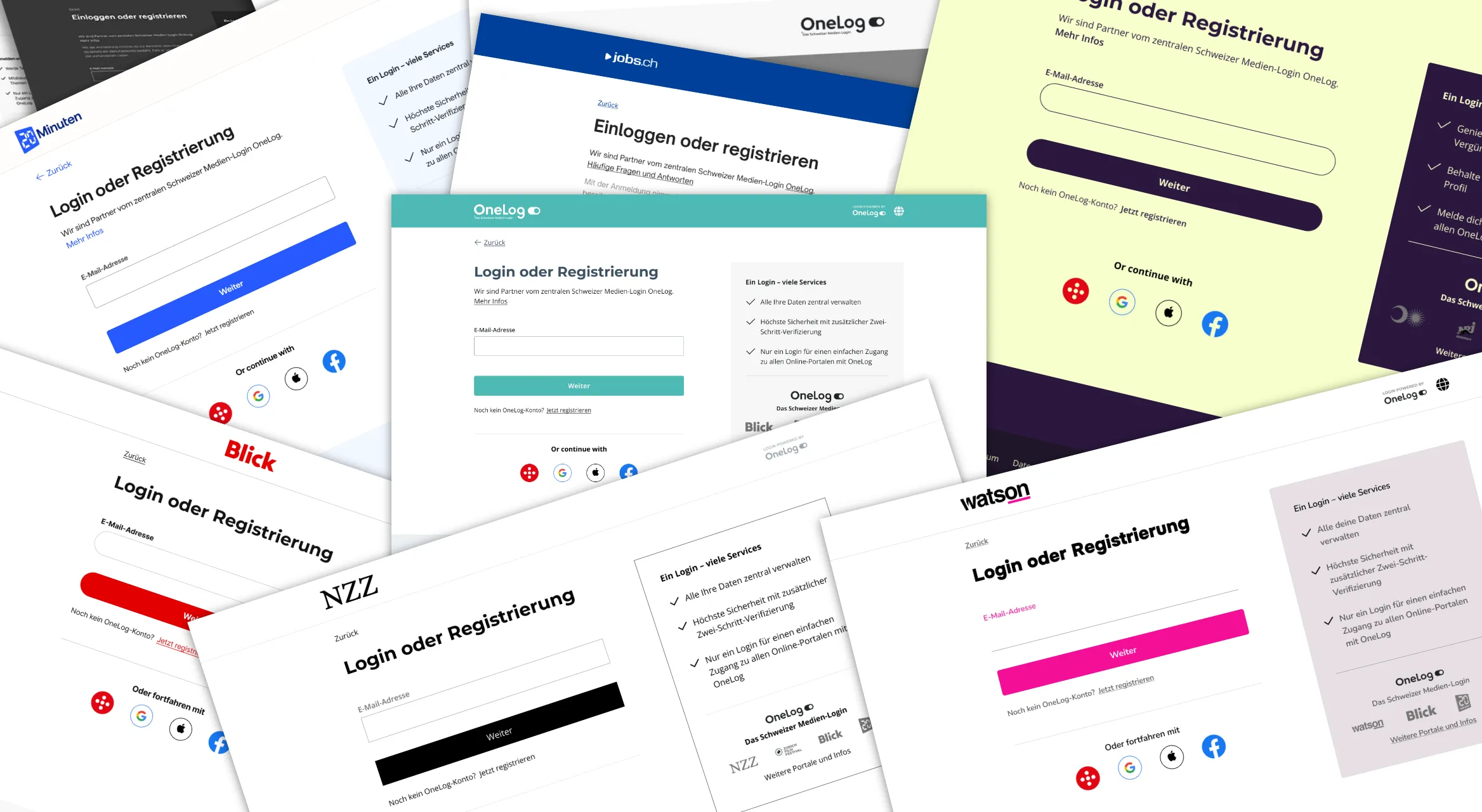
Enlarge image: The login screens of about ten Swiss media brands, among them 20 Minuten, Blick, NZZ, Watson and jobs.ch, tilted and overlapping around the OneLog master screen in the middle.
The same login screen in various themes – one component set underneath.

At a glance

OneLog was the shared login of the Swiss Digital Alliance – the step between a reader and an article on 20 Minuten, Blick, Tages-Anzeiger and dozens of other titles. To readers, it had to feel like part of the publisher’s own site, so every brand needed it in its own colours, type and logo. I rebuilt the design system and the theming workflow so a new brand theme became a configuration task instead of a design project, with WCAG AA as the baseline for every theme.

Client
OneLog AG
Industry
Swiss media & publishing
My role
UX/UI Design Lead
Duration
2022–25
Platform
Web, iOS, Android
Tools
Figma
Deliverables
Design system, theming workflow, component library, engineering handover

Impact

  • −80%

    time to create a new brand theme

  • AA

    WCAG level met by every theme

The challenge

Every brand wanted its own look.

Each publisher came with its own colours, typefaces and logo, and its own idea of what a button should look like. OneLog had to follow every one of them, on every screen a reader might see – from the first login to a forgotten password.

The design system wasn’t built for that. Every new theme took more work than it should have, and with each brand we added, there was more to keep consistent.

And brand colours are rarely chosen with screens in mind. A publisher’s signature colour can look right on a button and still be hard to read.

Approach

What changed underneath.

Tokens first, components second.

Before touching a single component, I split the foundations into primitive and semantic tokens. A brand only ever changes the semantic layer – its colours and typefaces – and the components never need to know which publisher they belong to. It also meant contrast could be checked once per theme, in the tokens, rather than screen by screen.
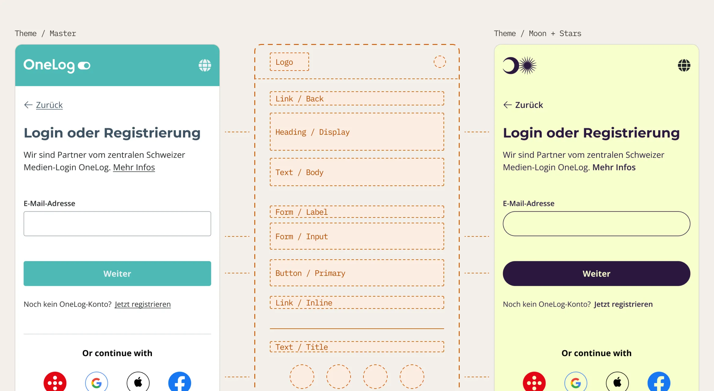
Enlarge image: The teal OneLog login screen and a pale yellow Moon + Stars login screen, with a dashed outline of their shared parts between them: logo, back link, heading, text, form field, button, link and social login buttons.
The master theme and a publisher theme on one component structure.

One theme, the whole flow.

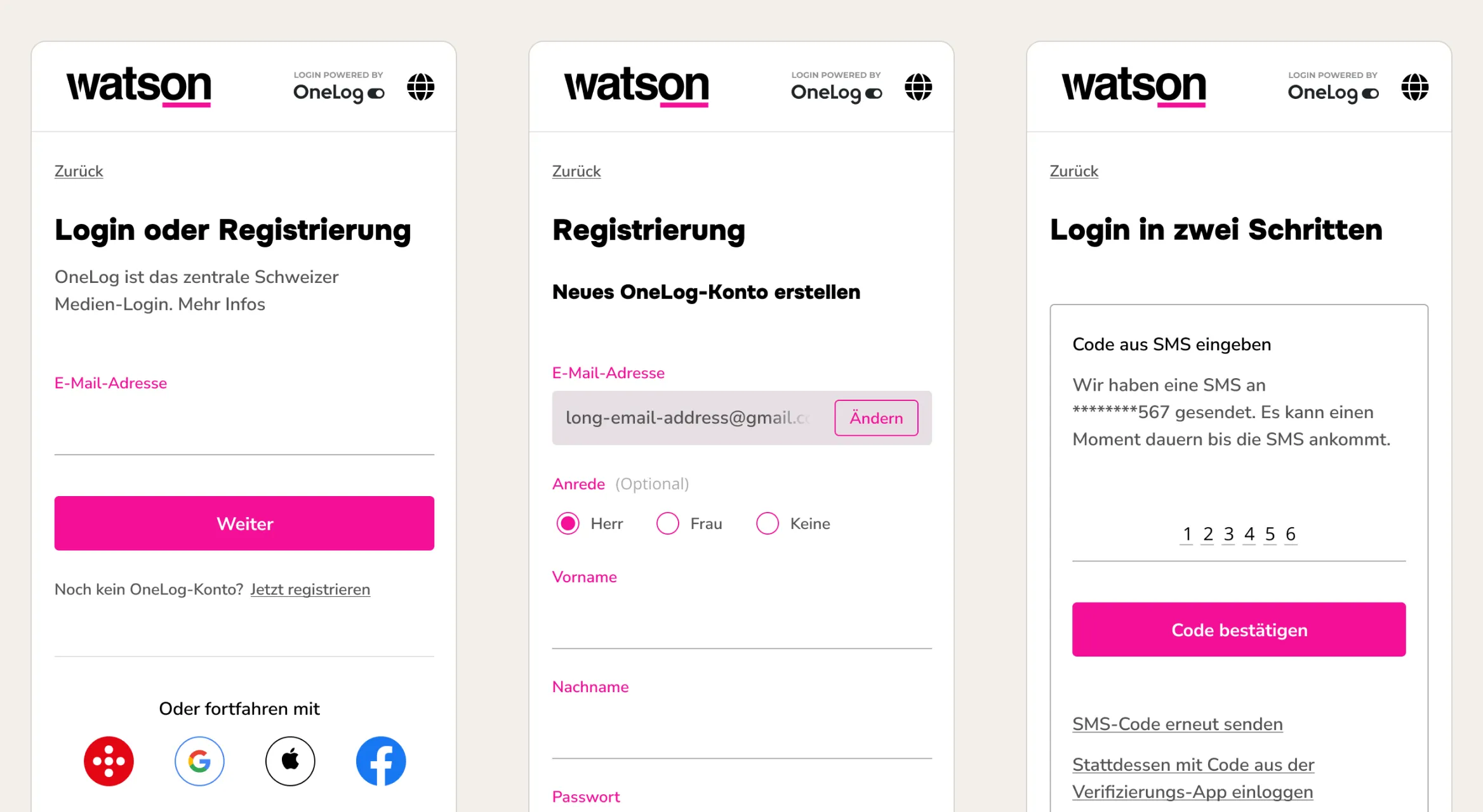
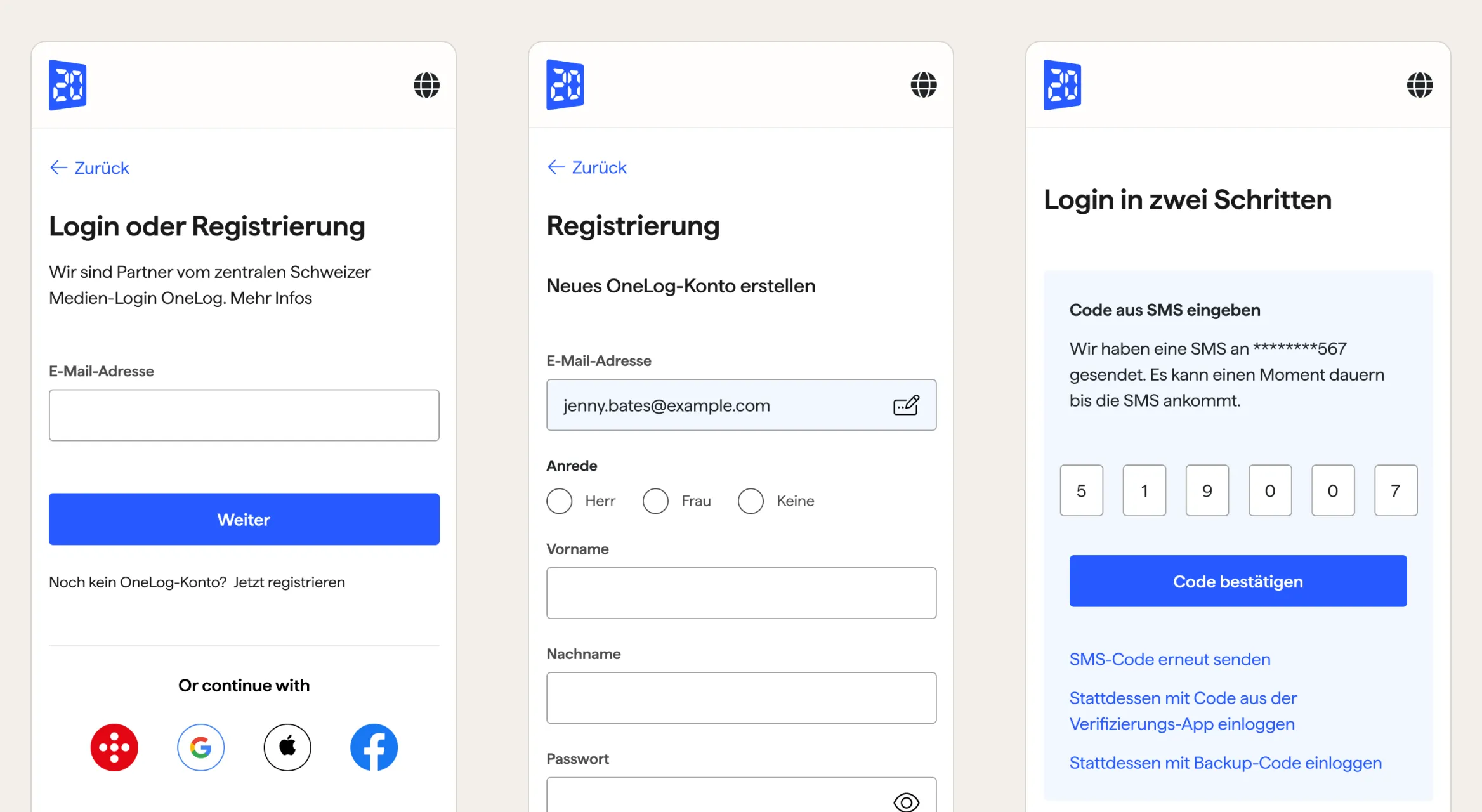
A theme isn’t one login screen. It has to hold up across the whole flow – registration, two-step verification, changing a password. Because every screen draws on the same components, a publisher’s values carry through all of them, including the states that rarely get designed on their own.

Enlarge image: Three 20 Minuten screens with blue buttons: login, registration with email, title and name fields, and entering a six-digit code from a text message.
20 Minuten: login, registration and two-step verification.
Enlarge image: The same three screens for Watson, with magenta buttons and labels and “Login powered by OneLog” in the header.
Watson: the same flow on the same components.

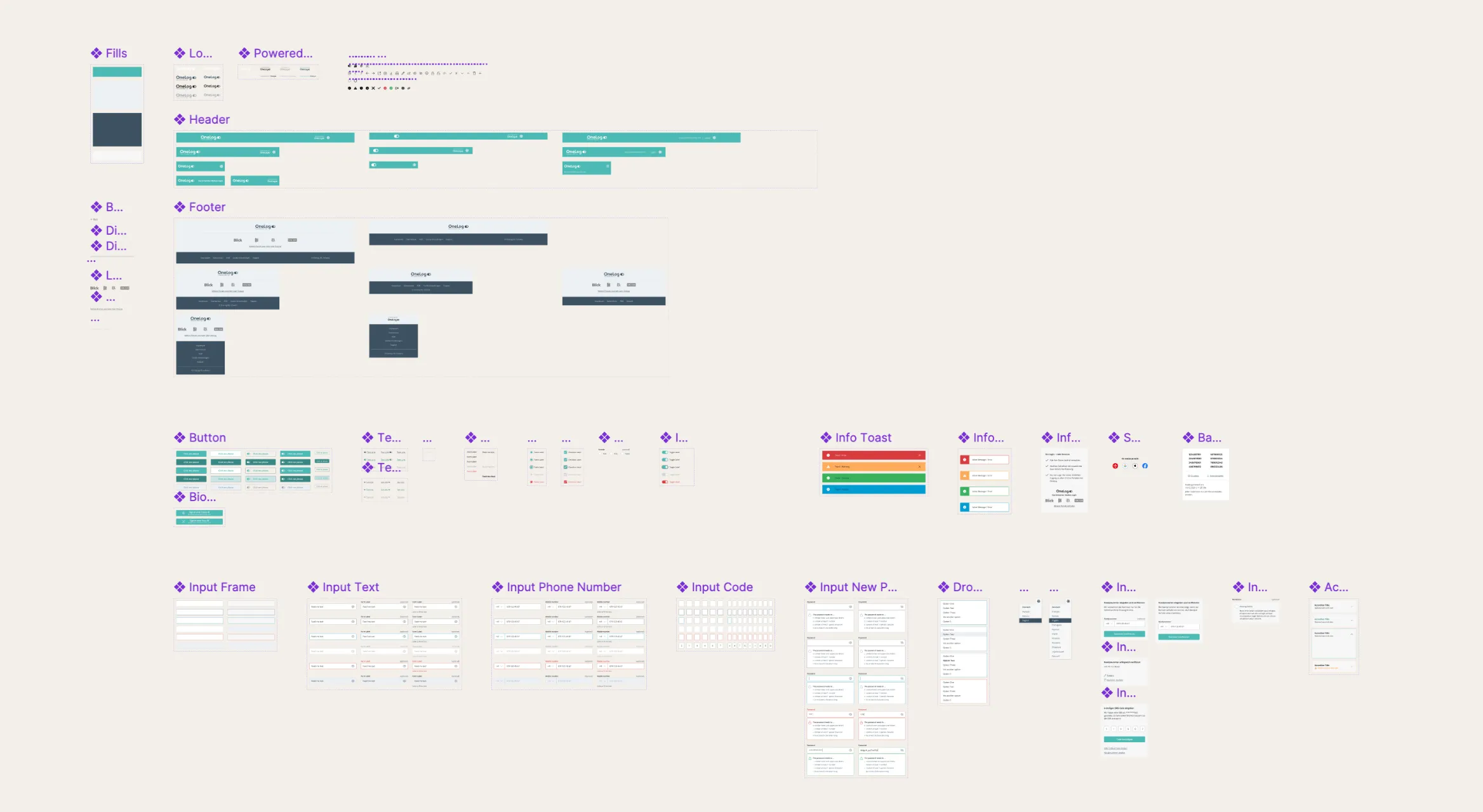
Figma and code, one structure.

I aligned component structure, naming and documentation with the front-end code, so the theme designed in Figma is the theme that ships.

Enlarge image: A zoomed-out Figma page of the OneLog component library, with fills, header, footer, buttons, messages and input fields laid out in groups.
Figma components shared by design and engineering.

Result

Theming became routine.

A new brand theme went from a project to a task – more than 80% faster – and every theme met WCAG AA from the start. The same system carried more than 40 brands.

Looking back

What I’d do differently.

I’d bring engineering into the token naming even earlier. The structure held up, but a few names were designed for Figma first and had to be renamed in code, a small cost that one shared session on day one would have avoided.

Contact

Let’s make it simple.

Open to freelance projects, full-time roles, and interesting conversations.

Visit me on LinkedIn